
UPDATE: Couple of months after I shared this project (May 2014), Istanbul's official subway map was updated and many of the issues that I explain here were adressed. The map that is mentioned as the "current map" in this page is the version before that update.
GÜNCELLEME: Ben bu projeyi paylaştıktan (Mayıs 2014) birkaç ay sonra, İstanbul'un resmi metro haritası güncellendi ve bu yazıda irdelenen birçok sorun giderildi. Bu sayfada "mevcut harita" olarak bahsi geçen, o güncellemeden önceki versiyondur.
This project was done by myself in my free time, and is not official. It has no relation to İstanbul Ulaşım A.Ş. or other organizations.
As a designer, Istanbul's subway map has been bugging me for a long time. It may have been a quite decent design when first introduced, but additions made over the years have lacked the same quality. As the new lines were introduced, they started overlapping and the map became cluttered. A new map, designed with the proposed lines in mind, was needed. But we only got new lines shoved into the empty spaces found on the map. I decided to act on my constant discomfort with the map, and made the changes that I believed were needed.
Bu proje boş zamanlarımı değerlendirmek için tarafımdan hazırlanmıştır, resmi bir çalışma değildir. İstanbul Ulaşım A.Ş. veya diğer ilgili kurumlarla bir bağlantısı yoktur.
Bir tasarımcı olarak İstanbul'un metro haritası beni uzun zamandır rahatsız ediyordu. İlk tasarlandığı zaman belirli bir kalitenin üzerinde hazırlanmış olsa da, zaman geçtikçe yapılan eklemeler aynı kalitede olmuyordu. İstanbul'un metro hatları arttıkça, metro haritası da şişmeye, üst üste binmeye başladı. İleride açılacak hatları da hesaba katarak tamamen yeni bir düzenleme yapılması gerekirken, boş kalan yerlere yeni hatlar sıkıştırılarak ilerleniyordu. Bu durumun beni sürekli rahatsız etmesinden sıkıldım ve yapılmasını gerektiğini düşündüğüm değişiklikleri kendim yaptım.

The end result / Ortaya çıkan çalışma
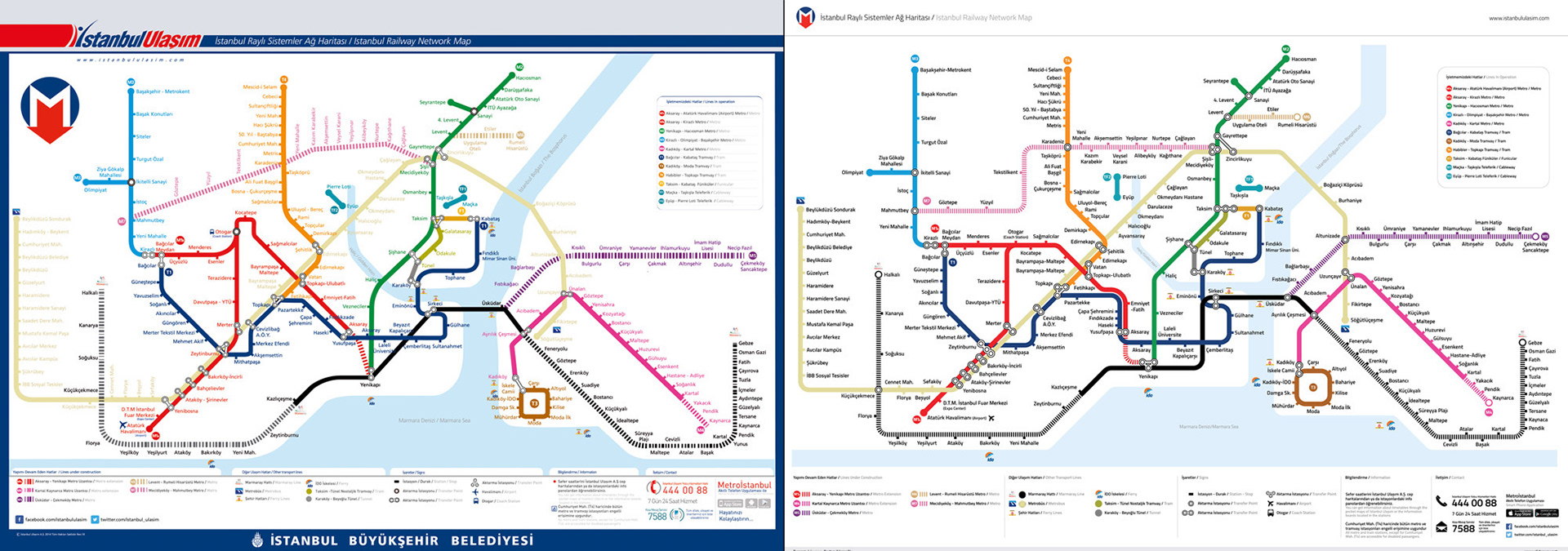
Current map vs. my map / Mevcut harita ile benim haritam
My biggest annoyance was that the 45 / 90 / 135 degree angles were used at some places and ignored at others. I started out by using them throughout the entire map and tried to achieve consistency. At some crowded points of the map, stop names were written on the lines and created a readability problem. I moved things around and solved this.
Haritada beni en rahatsız veren şeylerden biri 45 / 90 / 135 derecelik açıların bazı yerlerde kullanılıp bazı yerlerde kullanılmamasıydı. İlk iş olarak kullanımı tüm haritaya yayıp bütünlük sağlamaya çalıştım. Bazı sıkışık noktalarda durak isimleri hatların üzerine denk geliyor ve okunma problemi yaratıyordu, bunları kaldırdım.
Haritada beni en rahatsız veren şeylerden biri 45 / 90 / 135 derecelik açıların bazı yerlerde kullanılıp bazı yerlerde kullanılmamasıydı. İlk iş olarak kullanımı tüm haritaya yayıp bütünlük sağlamaya çalıştım. Bazı sıkışık noktalarda durak isimleri hatların üzerine denk geliyor ve okunma problemi yaratıyordu, bunları kaldırdım.
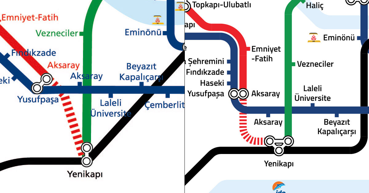
You'll notice two stops named "Aksaray". These are two completely different stops with no direct connection to each other, but have the same name. / Haritada "Aksaray" isimli iki durak göreceksiniz. Bunlar birbiriyle direkt bağlantısı olmayan fakat aynı ismi taşıyan tamamen farklı iki durak
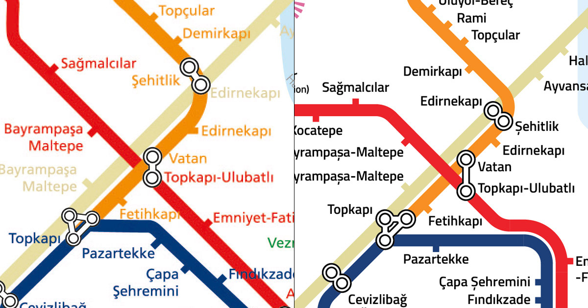
Stop names and subway lines being the same color created a logical problem for the transfer points. Therefore I changed all the stop names to a single color. There were problems with the small details as well; for example, Şehitlik and Edirnekapı are transfer points connected to each other, the orange line passes through Şehitlik but not through Edirnekapı (it goes through another station called "Edirnekapı", not connected to the transfer point in question). This wasn't very clear on the current map. I tried to clear up details like this with the changes I made.
Durak isimlerinin hatlarla aynı renkte olması, aktarma istasyonlarında mantık hatasına sebep oluyordu. Bu sebeple tüm durak isimlerini tek renge çektim. Haritadaki ufak detaylarda da sorun vardı, örneğin Şehitlik ve Edirnekapı birbirine bağlı aktarma istasyonları, turuncu hat Şehitlik'ten geçip Edirnekapı'dan geçmiyor (adı "Edirnekapı" olan, fakat mevzubahis aktarma istasyonuyla bağlantısı olmayan başka bir duraktan geçiyor). Ama bu haritada net bir şekilde belli olmuyordu. Yaptığım düzeltmelerle bunun gibi karışıklıkları gidermeye çalıştım.
Durak isimlerinin hatlarla aynı renkte olması, aktarma istasyonlarında mantık hatasına sebep oluyordu. Bu sebeple tüm durak isimlerini tek renge çektim. Haritadaki ufak detaylarda da sorun vardı, örneğin Şehitlik ve Edirnekapı birbirine bağlı aktarma istasyonları, turuncu hat Şehitlik'ten geçip Edirnekapı'dan geçmiyor (adı "Edirnekapı" olan, fakat mevzubahis aktarma istasyonuyla bağlantısı olmayan başka bir duraktan geçiyor). Ama bu haritada net bir şekilde belli olmuyordu. Yaptığım düzeltmelerle bunun gibi karışıklıkları gidermeye çalıştım.
Again, 2 stops not connected to each other with the same name. One solution I could offer would be to rename them "Edirnekapı 1" and "Edirnekapı 2", or giving one of them a completely diffrent name. But since I tried to change as little as possible, I left the names the way they are. / Yine birbiriyle bağlantısı olmayan ama aynı adı taşıyan 2 durak. Bir çözüm olarak bu durakların isimlerini "Edirnekapı 1" ve "Edirnekapı 2" şeklinde değiştirmeyi veya tamamen farklı isimler vermeyi önerebilirim. Fakat olabildiğince az değişiklik yapmak istediğimden dolayı isimleri olduğu gibi bıraktım.
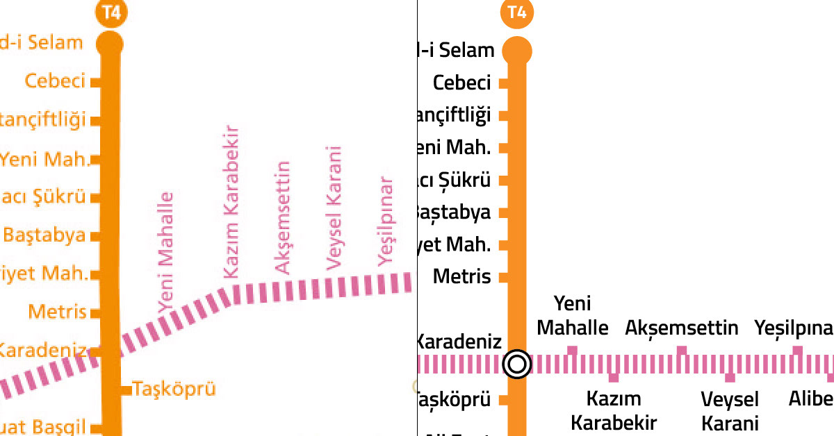
I made sure that all the text were horizontal and easily readable. Clarified the stops and transfer points on the lines under construction.
Okumayı kolaylaştırma adına tüm yazıları yatay hale getirdim. Yapımı devam eden hatların üzerindeki durakları ve aktarma istasyonlarını netleştirdim.
Okumayı kolaylaştırma adına tüm yazıları yatay hale getirdim. Yapımı devam eden hatların üzerindeki durakları ve aktarma istasyonlarını netleştirdim.
Some details in the background, like The Bosphorus, were sloppy. I made those more precise and consistent with the rest of the map.
İstanbul Boğazı gibi arka plandaki bazı detaylar özensizdi. Bunları temizleyip çalışmanın geri kalanıyla uyumlu hale getirdim.
İstanbul Boğazı gibi arka plandaki bazı detaylar özensizdi. Bunları temizleyip çalışmanın geri kalanıyla uyumlu hale getirdim.

To make the work as realistic and usable as possible, I tried to keep all the information on the original map. The end result is in no way a finalized product and there's vast room for improvement. But I believe it's the first of many steps in the right direction.
Çalışmanın olabildiğince gerçekçi ve kullanılabilir olması için orijinal haritanın üzerindeki tüm bilgileri kullanmaya çalıştım. Çıkan sonuç kesinlikle sonlanmış bir çalışma değildir ve eminim daha geliştirilecek birçok yeri vardır. Fakat doğru yönde atılacak birçok adımdan ilki olduğuna inanıyorum.
You can download the pdf version here and use it as you wish as long as you acknowladge credit. (Last updated: 10.03.2016)
Çalışmanın pdf versiyonunu buradan indirebilir, kaynak verme suretiyle arzu ettiğiniz şekilde kullanabilirsiniz. (Son güncellenme tarihi: 10.03.2016)